Fireflies two or three
Something I have attempted to develop over the last few years, with limited success, is a habit of writing – getting used to writing regularly and as a matter of routine, with the goal of making more serious writing projects less imposing. It’s one of the purposes of blogging, if not the only one. At one point I had in mind trying to copy newspaper columnists – turning out an article, a blog, whatever, on a weekly basis. I’ve obviously not managed it, but not entirely for the want of ideas, more for the want of getting it done. So instead, I’m thinking of taking a different approach, also from the newspapers – this time to copy the sort of ‘diary’ format that (at least The Times) columnists write: 3 or 4 shorter pieces that are each just an observation, a brief encounter, or passing thought.
I think it might be quite a good way of catching the germ of an idea, and making sure I get it down and start the process of thinking it through. But also, I’ve been thinking that the format has an affinity to another genre that I really love – the miscellany. My favourite is Sei Shonangon’s The Pillow Book, but there are lots of other Japanese examples, and I can recall others from my childhood on a range of other different topics.
No doubt the vast majority of these projects are always destined to end in abandonment and failure, but there’s a certain optionality inherent in them, and if the ultimate goal is to get writing and thinking, then even if they get abandoned then even the act of starting can still achieve part of the object.
Infinity?!
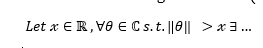
A couple of months ago I took a flight up to Edinburgh, and in the airport I picked up some magazines to read, including a copy of The Economist’s offshoot, 1843. It runs a column on great design, ‘I wish I’d done that’ – in the issue I purchased, it was Philippe Starck writing about the perfection of the infinity symbol, ∞. It was quite a good article, and it got me thinking about the wider range of mathematical notation. It’s not just that side-on 8, or even just the sort of things used in equations, there are a whole host of shorthand characters for making mathematical arguments, such that the following is a coherent (albeit probably useless) statement

At the real extremes you get the following, Bertrand Russell and Alfred Whitehead’s work Principia Mathematica which after 362 pages finally gets around to confirming that 1 + 1 does indeed = 2.

As I’ve used my maths less and less, almost nothing of the real technical content remains, and in place of solving equations I now mostly use hacked together Excel sheets. But some of these bits of shorthand remain in my note taking to this day as useful bits of lingo, θ, ∆, δ, □, ∃, a range of different relations from = to ≡ to ≅ and connectives like ∴ or ⇒. I think also perhaps these reflect the lingering presence of the ways in which my undergraduate education patterned my thought processes. I remember trying to solve problems, wrestling with a proof as an almost spatial process in my mind – trying to build a bridge from one side of the maths to the other, trying to feel a hole through a wall in order to derive the desired outcome. And I find it similar in writing an essay or a lecture – searching for a thread of argument or narrative to build a piece of work around, trying to understand the space of what I’m talking about and how it fits together.
Chess notation is also interesting/useful – exclamation marks as a positive, and question marks as a negative ! (good), !! (very good), ? (bad), ?? (very bad), ?! (dubious), !? (interesting). It recalls some of the (apocryphal?) Oxbridge essay marks – Alpha plus-minus-plus, and the like. There must be other shorthands and alphabets that reflect somehow a way of thinking about things. I seem to recall reading that Feynman diagrams are somehow not just a pictorial representation of a subatomic interaction, they’re a way of calculating outcomes. Or something.

Spring
It’s that time of the year, when the bluebells are out, the beeches are starting to grow leaves a colour of green that seems as though it shouldn’t exist in nature, and the birds are signing. I noticed a few years ago that the cuckoo’s call appears at this time of year. I don’t think I’ve ever seen a cuckoo (edit: I saw something the other day that might just have been one) but the sound of one calling across the fields, always distant, never seen, is very evocative.
For the last couple of months we’ve had some Lapwings in the fields around us. I first noticed them a few fields across, with a round winged flight that made me think of Star Wars fighters, and a call like someone tuning a radio. Not knowing what bird these things were at a distance, I looked them up and was a bit smug when I discovered Lapwings described as having a notable round winged flight and unusual call. I would have sworn that I’ve seen Lapwings before, but I’m pretty sure that I can’t have seen them in the air before. They don’t look like much on the ground, but this pair at least fly like they think they’re swallows.
Infographics
It occurred to me the other day that I really love infographics. I was looking at this one from Starbucks at the time – I love the look of it – but it’s by no means alone.

As I was thinking about it, I started to think about making my teaching materials more beautiful. The immediate outcome was that I used the chalky blackboard feel of this graphic for a lecture I was writing that week, but longer term I’ve been thinking about adding a more graphical/design dimension to the handouts I make. As it is I pay a bit of attention to making my slides and handouts and handbooks have a ‘look’ – standardised format, of course, but repeated use of signature images to tie them together, but perhaps I can do a bit more work to make the content more beautiful, too. The first one I’m thinking about is the handout I use for the Tokugawa four class structure. Watch this space.
